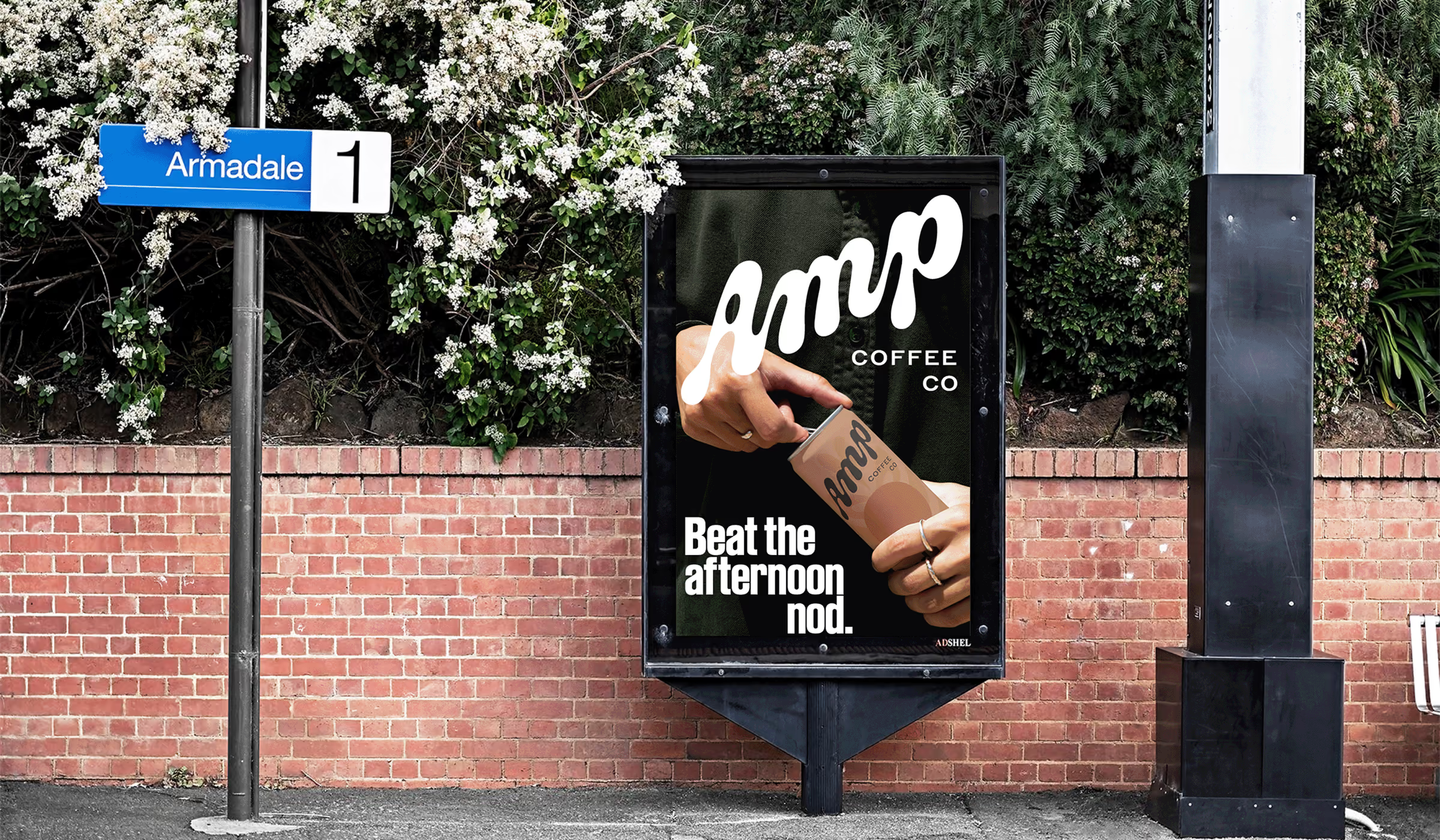
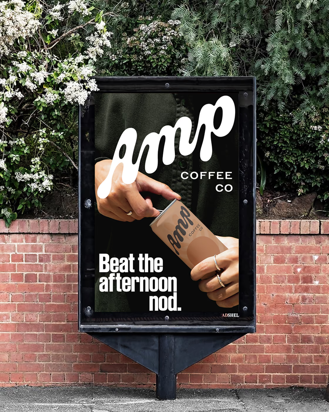
Beat the afternoon nod.
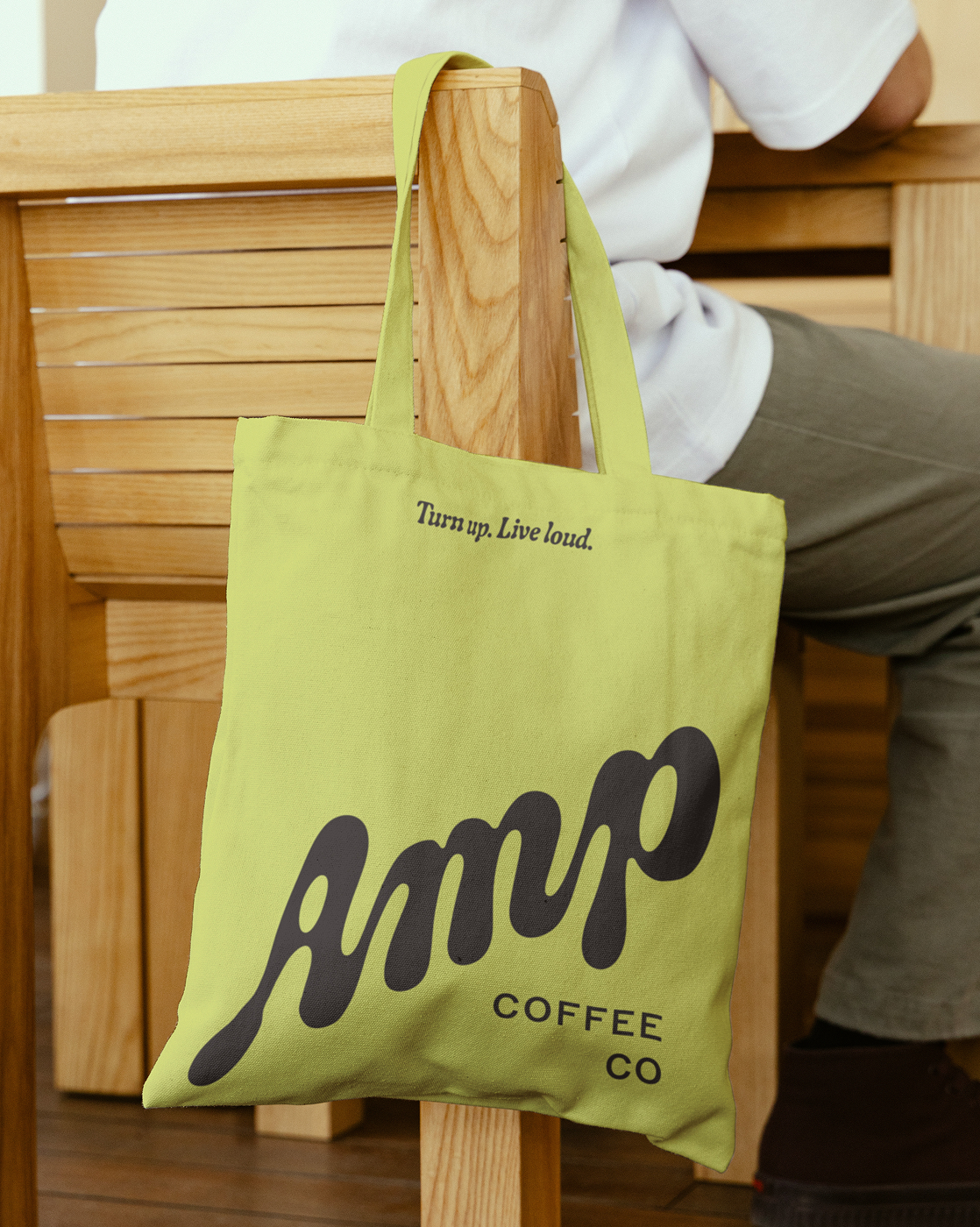
Turn Up. Live Loud.
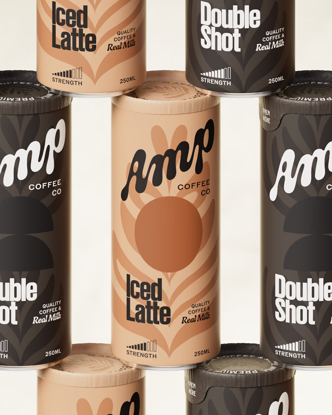
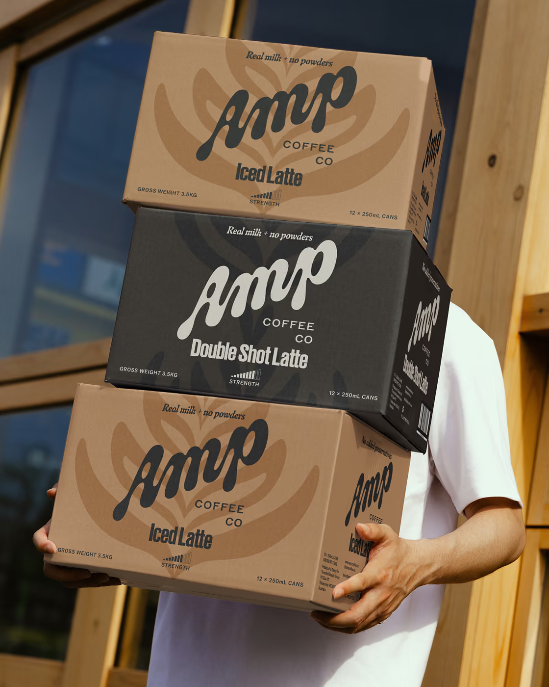
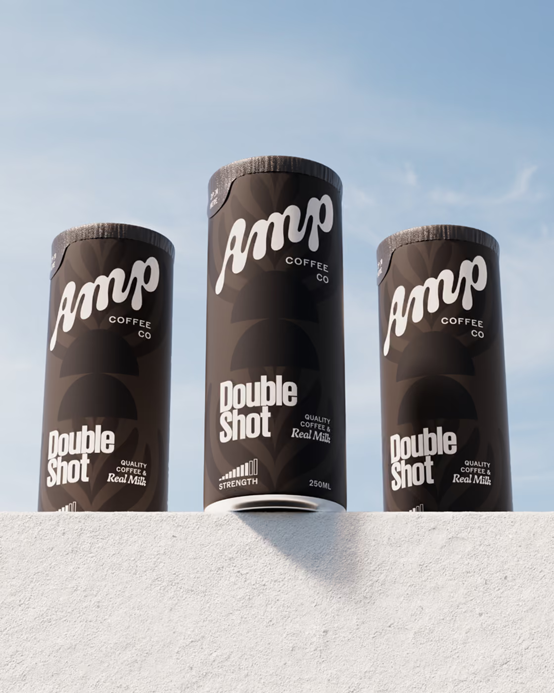
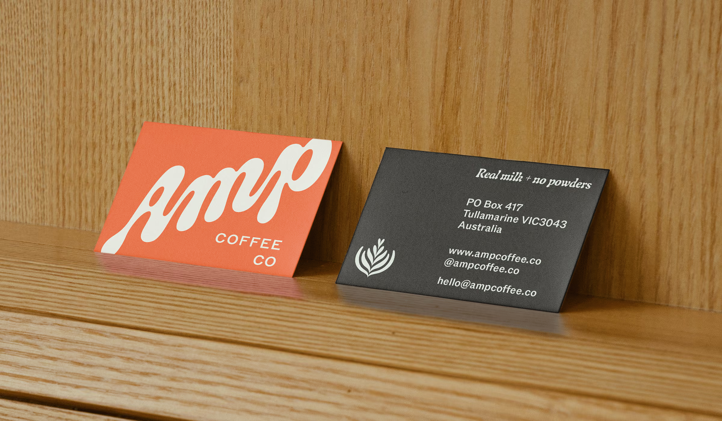
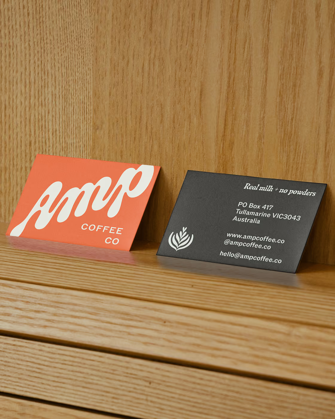
Amp Coffee Co is a new disruptor in the Australian canned iced coffee market. The identity is bold and aspirational without sliding into coffee snobbery. The fluid forms in the logotype, latte art graphics and secondary typography reflect the fresh milk that gives Amp its signature creamy taste.
Your Daily Coffee Kick
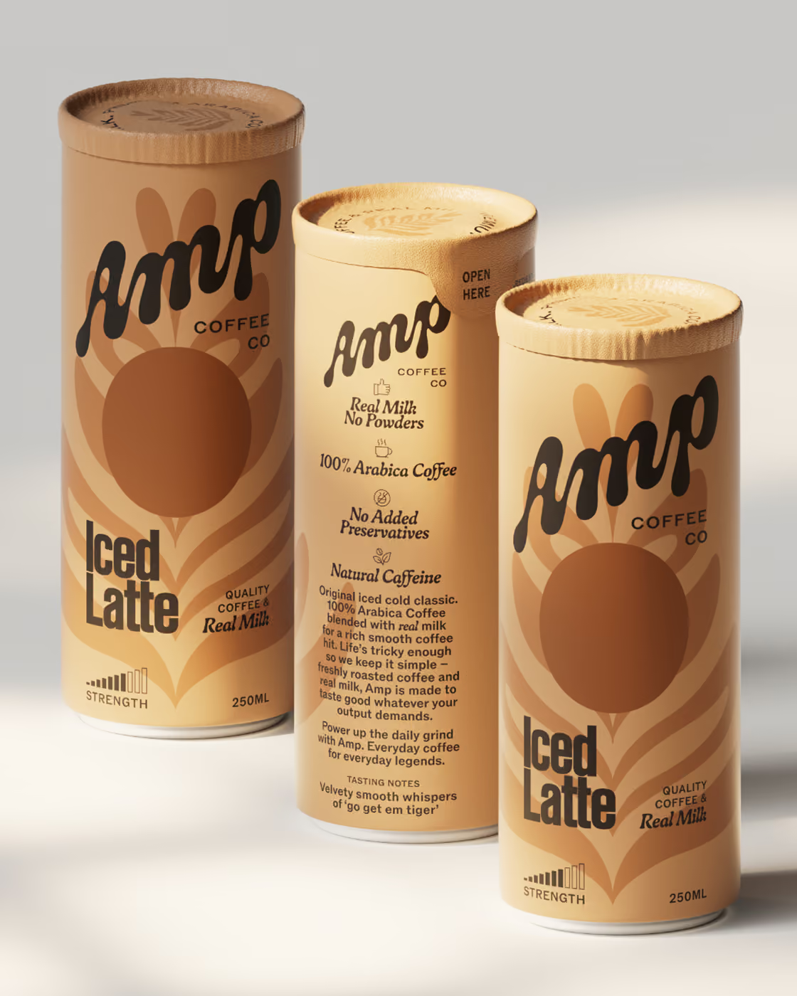
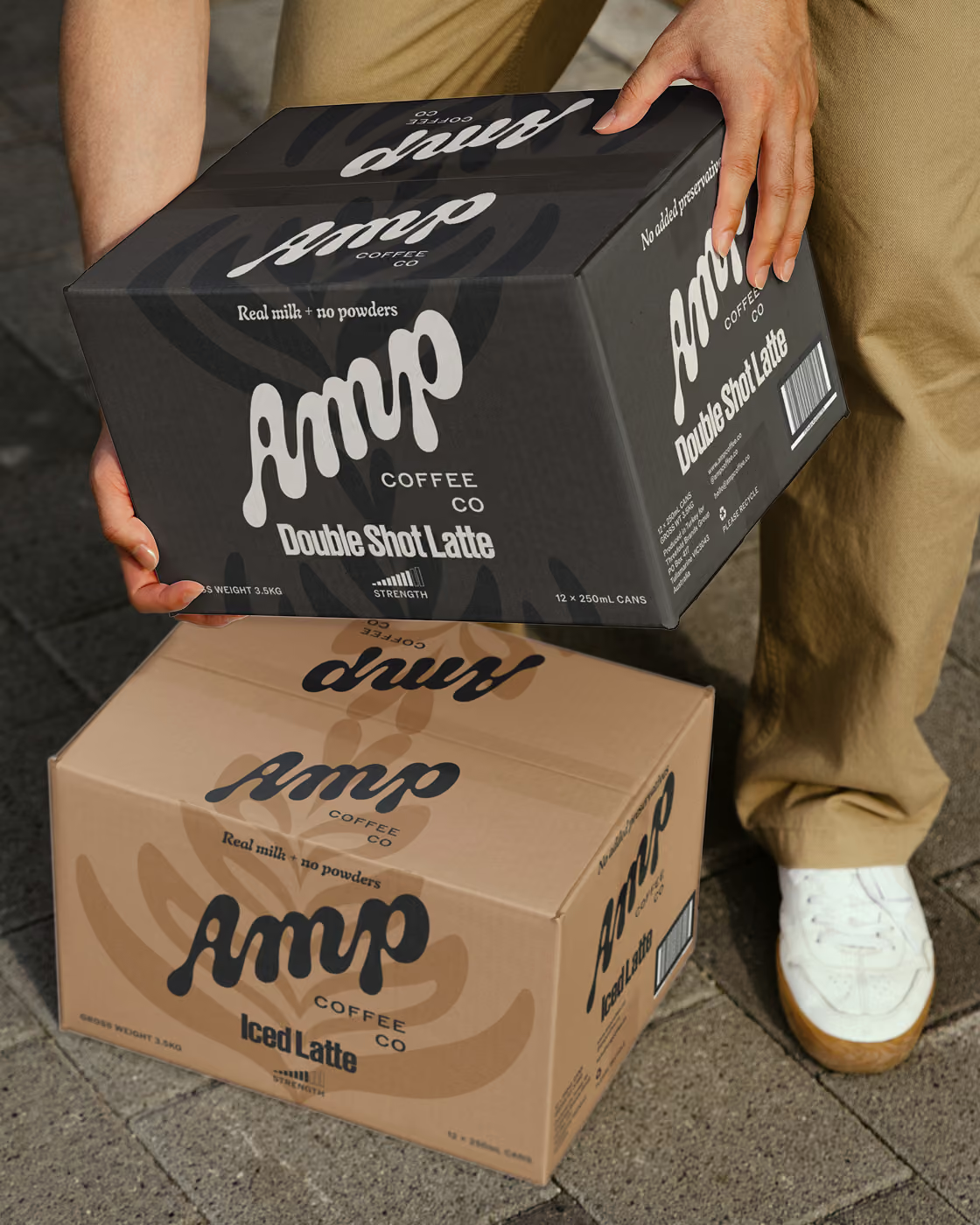
Hardworking yet light-hearted, the packaging design is distinctive enough to grab a time-poor shopper’s attention and stand tall beside category giants. The foil topper on each can is both hygienic and a small moment of delight, revealing rallying phrases beneath it: Live loud. Turn up. Kick goals.
Digital Presence
We turned an off-the-shelf Shopify template into a rich online brand experience for Amp Coffee Co, and created a suite of brand launch graphics to be shared across social platforms.
“Local Optima brings a unique combination of strong strategic thinking, incredible creativity and excellent communication. Their talent is understanding design, translating our briefs into a compelling visual language that connects to consumers. We always know what to expect, and are constantly impressed by the work they deliver. Having worked across consumer goods for over two decades, it’s rare to find such a comprehensive skill set.”